1. はじめに
このセクションは規定的ではありません。
transform プロパティおよび関連プロパティは、 boxを 配置された位置に対して任意の位置に再配置 (および回転、拡大縮小など) することを可能にし、 他のページ要素のレイアウトを妨げることなく操作できます。 これらの位置はCSSでアニメーションやトランジションが可能ですが、 比較的単純な方法しかできません: boxを開始位置から終了位置まで直線で移動させるだけです。
この仕様は offset ショートハンドと、 関連するロングハンドプロパティの一式を導入します。 これらは offset transform を定義します: 要素の特定のポイント (offset-anchor) を パス 上の offset position (offset-path と offset-distance) に 揃えて配置し、必要に応じてパスの方向に回転させます (offset-rotate)。
これにより、 強力な新しい変形方法が可能になります。 例えば、標準の矩形座標ではなく ray() 関数を使った 極座標による配置や、 要素を定義されたパスに沿ってアニメーションさせることができ、 複雑かつ美しい2次元空間遷移を簡単に定義できます。

飛行機は異なる offset-distance の値: 0%, 50%, 100% で表示されています。
1.1. モジュールの相互作用
この仕様は要素に適用できる追加の変形タイプを定義します (詳細は [css-transforms-1] を参照)。
CSS Transforms 2 § 6 Current Transformation Matrix で説明されているように、 本書で定義される変形は 個々の変形プロパティ (translate/rotate/scale (定義は [css-transforms-2])) の後、transform プロパティ (定義は [css-transforms-1]) の前にレイヤーされます。
1.2. 値
この仕様は CSSプロパティ定義規則 ([CSS21]) に従います。 <basic-shape> 型は CSS Shapes Module Level 1 [CSS-SHAPES] で定義されています。 <coord-box> 型は CSS Box Model Module Level 3 [CSS-BOX-3] で定義されています。 これらの仕様で定義されていない値型は CSS Values and Units Module Level 3 [CSS3VAL] で定義されています。
各プロパティ定義に記載された特定値に加えて、本仕様で定義される全プロパティは initial や inherit など CSS全体キーワードもプロパティ値として受け入れます ([CSS3VAL])。 可読性のため明示的には繰り返し記載していません。
2. モーションパス
2.1. パスの定義: offset-path プロパティ
| 名前: | offset-path |
|---|---|
| 値: | none | <offset-path> || <coord-box> |
| 初期値: | none |
| 適用対象: | 変形可能な要素 |
| 継承: | no |
| パーセンテージ: | n/a |
| 算出値: | 指定通り |
| 正規順序: | 文法通り |
| アニメーション型: | 算出値ごと |
| メディア: | visual |
offset path を指定し、 boxが配置される幾何学的なパスを定義します。
<offset-path> = <ray()> | <url> | <basic-shape>
値の意味は以下の通りです:
- none
-
要素は offset transform を持ちません。
- <offset-path> || <coord-box>
-
要素は offset transform を持ち、 何らかの offset path により定義されます。 § 2.7 オフセット変換の計算 を参照してください。
transform を持つ通常の効果 (例えば 積み重ねコンテキスト の生成など) も適用されます。 詳細は CSS Transforms 1 § 3 変形レンダリングモデル を参照。
<offset-path> が省略された場合、 デフォルトは inset(0 round X) となり、 X はこの要素の border-radius の値です。 包含ブロック を定める要素に基づきます。 <coord-box> が省略された場合、 デフォルトは border-box です。
各構成要素の解釈については以下の個別値を参照してください。
- <ray()>
-
offset path は origin から ある角度に向かって伸びる直線です。 詳細は § 2.1.1 ray() 関数 を参照してください。
<coord-box> は rayの 参照ボックス を提供します。
- <url>
-
SVGの shape element へのURL参照です。 offset path は 参照された要素の 等価なパス となります。[SVG2]
URLが shape element を参照しない場合 (他の要素を参照した場合や非SVG文書に解決した場合、解決できない場合など)、 path("m 0 0") (<basic-shape>) として動作します。
<coord-box> は shape element のビューポートおよびユーザー座標系を定義し、 原点 (0,0) は左上隅にあり、 単位は 1px です。
- <basic-shape>
-
offset path は 等価なパス です。 <basic-shape> 関数のもの。
全ての <basic-shape> で at <position> 引数が省略され、 かつ要素が offset starting position を offset-position で定義していれば、 その引数には指定された offset starting position が使われます。 それ以外は各関数の仕様通りのデフォルトになります。
<coord-box> は <basic-shape> の参照ボックスを提供します。
- <coord-box>
-
<offset-path> がサイズ指定に使うボックスを定義します。
CSSの文脈では、 参照されるボックスは この要素の 包含ブロック を定める要素のものです。
SVGの文脈では、 全ての値は view-box として振る舞います。
テスト
- offset-path-composition.html (ライブテスト) (ソース)
- offset-path-interpolation-001.html (ライブテスト) (ソース)
- offset-path-interpolation-002.html (ライブテスト) (ソース)
- offset-path-interpolation-003.html (ライブテスト) (ソース)
- offset-path-interpolation-004.html (ライブテスト) (ソース)
- offset-path-interpolation-005.html (ライブテスト) (ソース)
- offset-path-interpolation-006.html (ライブテスト) (ソース)
- offset-path-interpolation-007.html (ライブテスト) (ソース)
- offset-path-interpolation-008.html (ライブテスト) (ソース)
- offset-path-path-interpolation-001.html (ライブテスト) (ソース)
- offset-path-with-transforms-001.html (ライブテスト) (ソース)
- change-offset-path.html (live test) (ソース)
- offset-path-coord-box-001.html (ライブテスト) (ソース)
- offset-path-coord-box-002.html (ライブテスト) (ソース)
- offset-path-coord-box-003.html (ライブテスト) (ソース)
- offset-path-coord-box-004.html (ライブテスト) (ソース)
- offset-path-huge-angle-deg-001-crash.html (ライブテスト) (ソース)
- offset-path-huge-angle-grad-001-crash.html (ライブテスト) (ソース)
- offset-path-huge-angle-turn-001-crash.html (ライブテスト) (ソース)
- offset-path-ray-001.html (live test) (ソース)
- offset-path-ray-002.html (live test) (ソース)
- offset-path-ray-003.html (live test) (ソース)
- offset-path-ray-004.html (live test) (ソース)
- offset-path-ray-005.html (live test) (ソース)
- offset-path-ray-006.html (live test) (ソース)
- offset-path-ray-007.html (live test) (ソース)
- offset-path-ray-008.html (live test) (ソース)
- offset-path-ray-009.html (live test) (ソース)
- offset-path-ray-010.html (live test) (ソース)
- offset-path-ray-011.html (live test) (ソース)
- offset-path-ray-012.html (live test) (ソース)
- offset-path-ray-013.html (live test) (ソース)
- offset-path-ray-014.html (live test) (ソース)
- offset-path-ray-015.html (live test) (ソース)
- offset-path-ray-016.html (live test) (ソース)
- offset-path-ray-017.html (live test) (ソース)
- offset-path-ray-018.html (live test) (ソース)
- offset-path-ray-019.html (live test) (ソース)
- offset-path-ray-020.html (live test) (ソース)
- offset-path-ray-021.html (live test) (ソース)
- offset-path-ray-022.html (live test) (ソース)
- offset-path-ray-contain-001.html (ライブテスト) (ソース)
- offset-path-ray-contain-002.html (ライブテスト) (ソース)
- offset-path-ray-contain-003.html (ライブテスト) (ソース)
- offset-path-ray-contain-004.html (ライブテスト) (ソース)
- offset-path-ray-contain-005.html (ライブテスト) (ソース)
- offset-path-shape-circle-001.html (ライブテスト) (ソース)
- offset-path-shape-circle-002.html (ライブテスト) (ソース)
- offset-path-shape-circle-003.html (ライブテスト) (ソース)
- offset-path-shape-circle-004.html (ライブテスト) (ソース)
- offset-path-shape-circle-005.html (ライブテスト) (ソース)
- offset-path-shape-circle-006.html (ライブテスト) (ソース)
- offset-path-shape-circle-007.html (ライブテスト) (ソース)
- offset-path-shape-circle-008.html (ライブテスト) (ソース)
- offset-path-shape-ellipse-001.html (ライブテスト) (ソース)
- offset-path-shape-ellipse-002.html (ライブテスト) (ソース)
- offset-path-shape-ellipse-003.html (ライブテスト) (ソース)
- offset-path-shape-ellipse-004.html (ライブテスト) (ソース)
- offset-path-shape-ellipse-005.html (ライブテスト) (ソース)
- offset-path-shape-ellipse-006.html (ライブテスト) (ソース)
- offset-path-shape-ellipse-007.html (ライブテスト) (ソース)
- offset-path-shape-inset-001.html (ライブテスト) (ソース)
- offset-path-shape-inset-002.html (ライブテスト) (ソース)
- offset-path-shape-polygon-001.html (ライブテスト) (ソース)
- offset-path-shape-polygon-002.html (ライブテスト) (ソース)
- offset-path-shape-polygon-003.html (ライブテスト) (ソース)
- offset-path-shape-rect-001.html (ライブテスト) (ソース)
- offset-path-shape-rect-002.html (ライブテスト) (ソース)
- offset-path-shape-rect-003.html (ライブテスト) (ソース)
- offset-path-shape-shape-001.html (ライブテスト) (ソース)
- offset-path-shape-shape-002.html (ライブテスト) (ソース)
- offset-path-shape-shape-003.html (ライブテスト) (ソース)
- offset-path-shape-xywh-001.html (ライブテスト) (ソース)
- offset-path-shape-xywh-002.html (ライブテスト) (ソース)
- offset-path-shape-xywh-003.html (ライブテスト) (ソース)
- offset-path-string-001.html (ライブテスト) (ソース)
- offset-path-string-002.html (ライブテスト) (ソース)
- offset-path-string-003.html (ライブテスト) (ソース)
- offset-path-url-001.html (live test) (ソース)
- offset-path-url-002.html (live test) (ソース)
- offset-path-url-003.html (live test) (ソース)
- offset-path-url-004.html (live test) (ソース)
- offset-path-url-005.html (live test) (ソース)
- offset-path-url-006.html (live test) (ソース)
- offset-path-url-007.html (live test) (ソース)
- offset-path-url-008.html (live test) (ソース)
- offset-path-url-009.html (live test) (ソース)
- offset-path-url-010.html (live test) (ソース)
- offset-path-url-011.html (live test) (ソース)
- offset-path-url-crash.html (live test) (ソース)
- offset-path-computed.html (ライブテスト) (ソース)
- offset-path-parsing-invalid.html (ライブテスト) (ソース)
- offset-path-parsing-valid.html (ライブテスト) (ソース)
- offset-path-shape-computed.html (ライブテスト) (ソース)
- offset-path-shape-parsing.html (ライブテスト) (ソース)
2.1.1. ray() 関数
ray() 関数は、 offset path を ある点から定義された角度で伸びる直線として定義します。
ray() = ray( <angle> && <ray-size>? && contain? && [at <position>]? )

<ray-size> = closest-side | closest-corner | farthest-side | farthest-corner | sides
引数は次の通りです:
- <angle>
-
offset path は offset starting position から始まり、 指定された <angle> の 方向に進む単一の線分です。 (長さは他の引数によって決まります。) グラデーション関数 と同様に、 <angle> の値は方位角として解釈され、 0deg は上向き、 正の角度が時計回りの回転を表します。
- <ray-size>
-
offset path の長さ (offset-distance: 0% と offset-distance: 100% の間の距離) を包含ブロックに対して指定します。
<ray-size> が指定されていない場合、デフォルトは closest-side です。
注: sides の場合、 距離は指定された <angle> によって変化します。 他の値の場合は、<angle> に関係なく距離は一定です。
各キーワードの意味は次の通りです:
- closest-side
-
ray の開始点から 包含ブロック の最も近い辺までの距離です。
- closest-corner
-
ray の開始点から 包含ブロック の最も近い角までの距離です。
- farthest-side
-
ray の開始点から 包含ブロック の最も遠い辺までの距離です。
- farthest-corner
-
ray の開始点から 包含ブロック の最も遠い角までの距離です。
- sides
-
ray の開始点から offset path が 包含ブロック の境界と交差する点までの距離です。
ray の開始点が 包含ブロック の境界上、 または境界外にある場合は、 距離はゼロになります。
注: closest-side や closest-corner の場合、 ray の開始点が辺や角の上にある場合、 それが最も近いものとなります。 (つまり距離はゼロです。)
注: closest-side や farthest-side の場合、 ray の開始点が 包含ブロック の外にある場合、 包含ブロック の端は無限まで伸びているとみなされます。
- contain
-
offset path の長さが 包含ブロック の中に offset-distance: 100% でも 要素が収まるように短くなります。
具体的には、パスの長さは 要素のボーダーボックスの幅または高さのうち大きい方の半分だけ短くなり、 最低値はゼロです。
この振る舞いは特定のケース(要素の幅と高さが等しいかほぼ等しい場合、 border-radius により完全に丸みを帯びているか、角が見た目に影響しない場合、 ray() で closest-side の位置指定を使う場合、 offset-anchor が center の場合) に最適化されています。これらの条件下では、 (例えば丸い時計の縁に要素を配置するなど) 各要素が offset-distance: 100% の時に 時計の内縁ぎりぎりに配置されることを保証します。
他の条件でも似たような動作になりますが、最適とは限りません。
- at <position>
-
ray の origin(始点、0% の位置)を指定します。 <position> に従い、 ボックスの 包含ブロック 内に 0x0 のオブジェクト領域を配置して解決されます。
省略された場合は、 要素の offset starting position (offset-position で指定) を使います。
要素が offset starting position を持たない場合は、 at center として振る舞います。
注: ray() は現在 offset path としてのみ使用可能です。 将来的に他の用途に拡張された場合も、 offset-position の利用は offset path の場合に限定されます。 他の <basic-shape> 関数と同様です。
テスト
- ray-angle-interpolation-math-functions.html (ライブテスト) (ソース)
- offset-path-ray-001.html (live test) (ソース)
- offset-path-ray-002.html (live test) (ソース)
- offset-path-ray-003.html (live test) (ソース)
- offset-path-ray-004.html (live test) (ソース)
- offset-path-ray-005.html (live test) (ソース)
- offset-path-ray-006.html (live test) (ソース)
- offset-path-ray-007.html (live test) (ソース)
- offset-path-ray-008.html (live test) (ソース)
- offset-path-ray-009.html (live test) (ソース)
- offset-path-ray-010.html (live test) (ソース)
- offset-path-ray-011.html (live test) (ソース)
- offset-path-ray-012.html (live test) (ソース)
- offset-path-ray-013.html (live test) (ソース)
- offset-path-ray-014.html (live test) (ソース)
- offset-path-ray-015.html (live test) (ソース)
- offset-path-ray-016.html (live test) (ソース)
- offset-path-ray-017.html (live test) (ソース)
- offset-path-ray-018.html (live test) (ソース)
- offset-path-ray-019.html (live test) (ソース)
- offset-path-ray-020.html (live test) (ソース)
- offset-path-ray-021.html (live test) (ソース)
- offset-path-ray-022.html (live test) (ソース)
- offset-path-ray-contain-001.html (ライブテスト) (ソース)
- offset-path-ray-contain-002.html (ライブテスト) (ソース)
- offset-path-ray-contain-003.html (ライブテスト) (ソース)
- offset-path-ray-contain-004.html (ライブテスト) (ソース)
- offset-path-ray-contain-005.html (ライブテスト) (ソース)
< style >
body {
transform-style : preserve-3d ;
width : 200 px ;
height : 200 px ;
}
. box {
width : 50 px ;
height : 50 px ;
offset-position : 50 % 50 % ;
offset-distance : 100 % ;
offset-rotate : 0 deg ;
}
# redBox {
background-color : red ;
offset-path : ray ( 45 deg closest -side );
}
# blueBox {
background-color : blue ;
offset-path : ray ( 180 deg closest -side );
}
</ style >
< body >
< div class = "box" id = "redBox" ></ div >
< div class = "box" id = "blueBox" ></ div >
</ body >
2番目の例では、各ボックスの contain を offset-path の値に指定することで、はみ出しを防いでいます。
< style >
body {
transform-style : preserve-3d ;
width : 200 px ;
height : 200 px ;
}
. box {
width : 50 px ;
height : 50 px ;
offset-position : 50 % 50 % ;
offset-distance : 100 % ;
offset-rotate : 0 deg ;
}
# redBox {
background-color : red ;
offset-path : ray ( 45 deg closest -side contain );
}
# blueBox {
background-color : blue ;
offset-path : ray ( 180 deg closest -side contain );
}
</ style >
< body >
< div class = "box" id = "redBox" ></ div >
< div class = "box" id = "blueBox" ></ div >
</ body >
3番目の例では、パスサイズが大きくされてボックスが収まるようになっています。used offset distance は負の値です。
< style >
body {
transform-style : preserve-3d ;
width : 250 px ;
height : 250 px ;
}
. box {
width : 60 % ;
height : 10 % ;
offset-position : 20 % 20 % ;
offset-distance : 0 % ;
offset-rotate : 0 deg ;
offset-anchor : 200 % -300 % ;
}
# blueBox {
background-color : blue ;
offset-path : ray ( -90 deg closest -side contain );
}
</ style >
< body >
< div class = "box" id = "blueBox" ></ div >
</ body >

4番目の例では、初期位置が包含ブロックの外側にあります。
< style >
# container {
transform-style : preserve-3d ;
width : 200 px ;
height : 200 px ;
}
. box {
width : 20 % ;
height : 20 % ;
offset-position : 140 % 70 % ;
offset-distance : 100 % ;
}
# redBox {
background-color : red ;
offset-path : ray ( -90 deg sides );
}
# blueBox {
background-color : blue ;
offset-path : ray ( 180 deg closest -side );
}
</ style >
< div id = "container" >
< div class = "box" id = "redBox" ></ div >
< div class = "box" id = "blueBox" ></ div >
</ div >

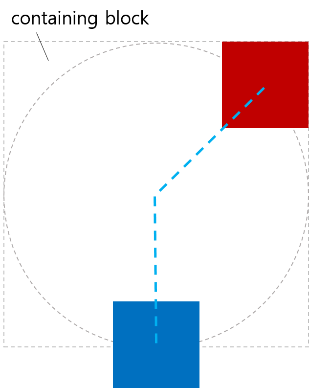
2.1.2. <basic-shape>配置の例
< style >
body {
width : 323 px ;
height : 131 px ;
margin : 0 px ;
border : 2 px solid black ;
padding : 8 px ;
transform-style : preserve-3d ;
}
. item {
width : 90 px ;
height : 40 px ;
background-color : violet ;
}
# middle {
offset-position : auto ;
offset-path : circle( 60 % ) margin-box ;
offset-distance : 25 % ;
offset-anchor : left top ;
}
</ style >
< body >
< div class = "item" ></ div >
< div class = "item" id = "middle" ></ div >
< div class = "item" ></ div >
</ body >

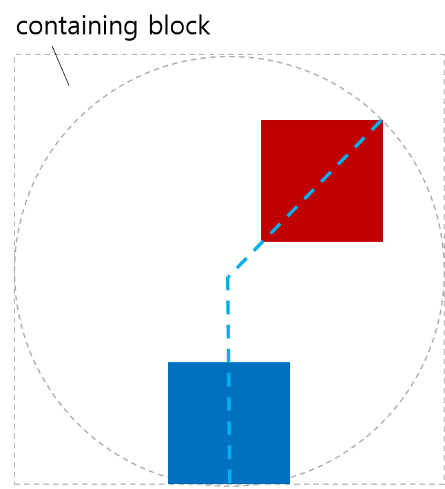
2.1.3. <coord-box>配置の例
< style >
body {
width : 500 px ;
height : 300 px ;
border-radius : 80 px ;
border : dashed aqua ;
margin : 0 ;
}
# blueBox {
width : 40 px ;
height : 20 px ;
background-color : blue ;
offset-path : margin-box ;
}
</ style >
< body >
< div id = "blueBox" ></ div >
</ body >

2.2. パス上の位置: offset-distance プロパティ
| 名前: | offset-distance |
|---|---|
| 値: | <length-percentage> |
| 初期値: | 0 |
| 適用対象: | 変形可能な要素 |
| 継承: | no |
| パーセンテージ: | offset path の長さに対する割合 |
| 算出値: | 算出された<length-percentage>値 |
| 正規順序: | 文法通り |
| アニメーション型: | 算出値ごと |
| メディア: | visual |
offset path に沿ってoffset positionがどこにあるかを指定します。
- <length-percentage>
-
offset position は、 要素の offset path に沿った 指定された距離の位置です。 パス上の距離の計算については§ 2.2.1 パスに沿った算出距離の計算を参照してください。
パーセンテージは offset path の全長に対する割合です。
テスト
- offset-distance-composition.html (ライブテスト) (ソース)
- offset-distance-interpolation.html (ライブテスト) (ソース)
- offset-distance-interpolation-001.html (ライブテスト) (ソース)
- offset-distance-001.html (live test) (ソース)
- offset-distance-002.html (live test) (ソース)
- offset-distance-003.html (live test) (ソース)
- offset-distance-004.html (live test) (ソース)
- offset-distance-005.html (live test) (ソース)
- offset-distance-006.html (live test) (ソース)
- offset-distance-007.html (live test) (ソース)
- offset-distance-008.html (live test) (ソース)
- offset-distance-009.html (live test) (ソース)
- offset-distance-computed.html (ライブテスト) (ソース)
- offset-distance-parsing-invalid.html (ライブテスト) (ソース)
- offset-distance-parsing-valid.html (ライブテスト) (ソース)
注: offset-distance をアニメーションさせることで、要素は複雑なパスを簡単にたどることができます。
要素に offset path がない場合、このプロパティは何も行いません。
2.2.1. パスに沿った算出距離の計算
offset path に沿った距離の処理は、offset path の性質によって異なります:
-
contain付きの <angle> offset path への参照は、閉じていない区間です。
-
containなしの <angle> offset path への参照は、無限のrayです。
-
すべての基本CSSシェイプは閉じたループです。
-
Offset path(SVG Pathへの参照を含む)は、パスリストの最後のコマンドがclosepathコマンド("z"または"Z")である場合のみ閉じたループです。そうでない場合は閉じていない区間です。
-
SVGのcircle、ellipse、image、polygon、rectへの参照は閉じたループです。
-
SVGのlineとpolylineへの参照は閉じていない区間です。
与えられた offset path と offset distance に対する used offset distance を決定するには:
-
total length を offset path の全サブパスを含む総距離とする。
-
offset distance をピクセルに変換し、100%は total length に変換する。
-
- もし offset path が無限のrayなら:
-
used offset distance を offset distance と同じにする。
- それ以外で offset path が contain付きの <angle> パスなら:
-
used offset distance を offset distance にし、ボックスがパス内に完全に収まるよう制限する。
- 他の閉じていない区間なら:
-
used offset distance を offset distance にし、0からパスの総距離で制限する。
- それ以外は offset path が閉じたループ:
-
used offset distance を offset distance をパスの総距離で割った余り(modulo)とする。パスの総距離が0なら、used offset distance も0。
注: ここでの「modulo」は数学的な定義で、出力は常に非負です。
< style >
. item {
width : 100 px ;
height : 40 px ;
offset-position : 0 % 0 % ;
offset-path : path ( 'm 0 0 h 200 v 150' );
}
# box1 {
background-color : red ;
offset-distance : -280 % ;
}
# box2 {
background-color : green ;
offset-distance : 190 % ;
}
</ style >
< body >
< div class = "item" id = "box1" ></ div >
< div class = "item" id = "box2" ></ div >
</ body >

< style >
. item {
width : 100 px ;
height : 40 px ;
offset-position : 0 % 0 % ;
offset-path : path ( 'm 0 0 h 200 v 150 z' );
}
# box1 {
background-color : red ;
offset-distance : -280 % ;
}
# box2 {
background-color : green ;
offset-distance : 190 % ;
}
</ style >
< body >
< div class = "item" id = "box1" ></ div >
< div class = "item" id = "box2" ></ div >
</ body >

< style >
body {
transform-style : preserve-3d ;
width : 300 px ;
height : 300 px ;
border : dashed gray ;
border-radius : 50 % ;
}
. circleBox {
position : absolute ;
left : 50 % ;
top : 50 % ;
width : 40 px ;
height : 40 px ;
background-color : red ;
border-radius : 50 % ;
}
# circle1 {
offset-path : ray ( 0 deg farthest -side );
offset-distance : 50 % ;
}
# circle2 {
offset-path : ray ( 90 deg farthest -side );
offset-distance : 20 % ;
}
# circle3 {
offset-path : ray ( 225 deg farthest -side );
offset-distance : 100 % ;
}
</ style >
< body >
< div class = "circleBox" id = "circle1" ></ div >
< div class = "circleBox" id = "circle2" ></ div >
< div class = "circleBox" id = "circle3" ></ div >
</ body >
2.3. パスの開始点: offset-position プロパティ
| 名前: | offset-position |
|---|---|
| 値: | normal | auto | <position> |
| 初期値: | normal |
| 適用対象: | 変形可能な要素 |
| 継承: | no |
| パーセンテージ: | 包含ブロックのサイズに対して参照 |
| 算出値: | normal または auto キーワード、もしくは算出された <position> |
| 正規順序: | 文法通り |
| アニメーション型: | 算出値ごと |
| メディア: | visual |
offset starting position を指定します。これは、<offset-path> 関数が自身の開始位置を指定しない場合に使用されます。
値の定義は以下の通りです:
- normal
-
要素は offset starting position を持ちません。
- auto
-
offset starting position はボックスの左上隅です。
注: これは要素自身のボックスの左上隅であり、 包含ブロック の左上ではありません! top left を指定する場合とは全く異なります。 例えば、path() を要素自身の位置から開始させたい時などを想定しています。
- <position>
-
offset starting position は、 <position> を使ってボックスの 包含ブロック 内に 0x0 のオブジェクト領域を配置して決定されます。
テスト
< style >
# wrap {
position : relative ;
width : 300 px ;
height : 300 px ;
border : 1 px solid black ;
}
# box {
width : 100 px ;
height : 100 px ;
background-color : green ;
position : absolute ;
top : 100 px ;
left : 80 px ;
offset-position : auto ;
offset-anchor : center ;
offset-path : ray ( 45 deg );
}
</ style >
< body >
< div id = "wrap" >
< div id = "box" ></ div >
</ div >
</ body >
< style >
#wrap {
transform-style : preserve-3d ;
width : 400 px ;
height : 350 px ;
}
.item {
position : absolute ;
left : 200 px ;
top : 0 px ;
offset-position : 200 px 100 px ; /* 0px,100px だけ移動 */
offset-anchor : left top ;
transform-origin : left top ;
width : 130 px ;
height : 80 px ;
border-top-right-radius : 23 px ;
}
#box1 {
background-color : tomato ;
offset-position : auto ;
}
#box2 {
background-color : green ;
}
#box3 {
background-color : navy ;
rotate : 90 deg ; /* モーションパス変形の前に適用 */
}
#box4 {
background-color : gold ;
transform : rotate(90 deg ); /* モーションパス変形の後に適用 */
}
</ style >
< body >
< div id = "wrap" >
< div class = "item" id = "box1" ></ div >
< div class = "item" id = "box2" ></ div >
< div class = "item" id = "box3" ></ div >
< div class = "item" id = "box4" ></ div >
</ div >
</ body >

< style >
#wrap {
transform-style : preserve-3d ;
width : 500 px ;
height : 250 px ;
line-height : 0 px ;
}
span {
position : static ;
display : inline-block ;
width : 100 px ;
height : 50 px ;
border-top-right-radius : 23 px ;
scale : 2.5 2.5 ; /* モーションパス変形の前に適用 */
offset-position : center ;
transform : scale(0.4 ); /* モーションパス変形の後に適用 */
}
#box1 {
background-color : tomato ;
}
#box2 {
background-color : green ;
}
#box3 {
background-color : navy ;
}
#box4 {
background-color : gold ;
}
</ style >
< body >
< div id = "wrap" >
< div >
< span id = "box1" ></ span >< span id = "box2" ></ span >
</ div >
< div >
< span id = "box3" ></ span >< span id = "box4" ></ span >
</ div >
</ div >
</ body >

< style >
#wrap {
transform-style : preserve-3d ;
width : 540 px ;
height : 420 px ;
}
.item {
position : absolute ;
width : 90 px ;
height : 70 px ;
border-top-right-radius : 23 px ;
scale : 0.8 0.8 ; /* モーションパス変形の前に適用 */
offset-path : padding-box ;
offset-distance : 50 % ;
offset-rotate : 0 deg ;
offset-anchor : right bottom ;
transform : scale(1.25 ); /* モーションパス変形の後に適用 */
}
#box1 {
background-color : tomato ;
position : static ;
offset-position : auto ; /* 無視される */
}
#box2 {
background-color : green ;
right : 0 px ;
top : 0 px ;
offset-position : 23 % 45 % ; /* 無視される */
}
#box3 {
background-color : navy ;
left : 0 px ;
bottom : 0 px ;
offset-position : 34 % 56 px ; /* 無視される */
}
#box4 {
background-color : gold ;
right : 0 px ;
bottom : 0 px ;
offset-position : 45 px 67 px ; /* 無視される */
}
</ style >
< body >
< div id = "wrap" >
< div class = "item" id = "box1" ></ div >
< div class = "item" id = "box2" ></ div >
< div class = "item" id = "box3" ></ div >
< div class = "item" id = "box4" ></ div >
</ div >
</ body >

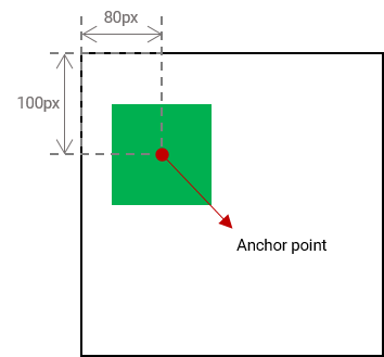
2.4. 要素のアンカーポイント: offset-anchor プロパティ
| 名前: | offset-anchor |
|---|---|
| 値: | auto | <position> |
| 初期値: | auto |
| 適用対象: | 変形可能な要素 |
| 継承: | no |
| パーセンテージ: | 要素の reference box の幅と高さに対する相対値 |
| 算出値: | auto キーワードまたは算出された <position> |
| 標準順序: | 文法に従う |
| アニメーション型: | 算出値による |
| メディア: | visual |
要素の offset anchor point ― offset position と offset path 上で揃える点を定義します。
値の意味は以下の通りです:
- auto
-
アンカーポイントは transform-origin で示される点と同じです。
具体的には、算出値の transform-origin は、要素の <position> として reference box に対して解決されます。
- <position>
-
アンカーポイントは、 <position> を要素の reference box に対して解決した結果となります。
テスト
- offset-anchor-composition.html (ライブテスト) (ソース)
- offset-anchor-interpolation.html (ライブテスト) (ソース)
- offset-anchor-transform-box-fill-box-001.html (ライブテスト) (ソース)
- offset-anchor-transform-box-fill-box-002.html (ライブテスト) (ソース)
- offset-anchor-transform-box-fill-box-003.html (ライブテスト) (ソース)
- offset-anchor-computed.html (ライブテスト) (ソース)
- offset-anchor-parsing-invalid.html (ライブテスト) (ソース)
- offset-anchor-parsing-valid.html (ライブテスト) (ソース)
どのボックスが基準になるかは Issue 503 で議論されています。
#plane {
    offset-anchor: center;
}
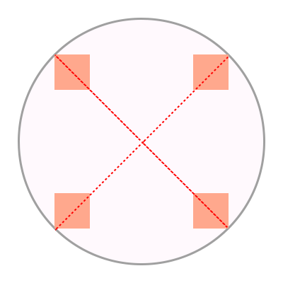
図形の中央にある赤い点が、その図形のアンカーポイントを示しています。

< style >
body {
transform-style : preserve-3d ;
width : 300 px ;
height : 300 px ;
border : 2 px solid gray ;
border-radius : 50 % ;
}
.box {
width : 50 px ;
height : 50 px ;
background-color : orange ;
offset-position : 50 % 50 % ;
offset-distance : 100 % ;
offset-rotate : 0 deg ;
}
#item1 {
offset-path : ray (45 deg closest -side );
offset-anchor : right top ;
}
#item2 {
offset-path : ray (135 deg closest -side );
offset-anchor : right bottom ;
}
#item3 {
offset-path : ray (225 deg closest -side );
offset-anchor : left bottom ;
}
#item4 {
offset-path : ray (315 deg closest -side );
offset-anchor : left top ;
}
</ style >
< body >
< div class = "box" id = "item1" ></ div >
< div class = "box" id = "item2" ></ div >
< div class = "box" id = "item3" ></ div >
< div class = "box" id = "item4" ></ div >
</ body >
< style >
body {
width : 500 px ;
height : 500 px ;
}
.box {
background-color : mediumpurple ;
offset-path : none ;
offset-anchor : center ;
}
#item1 {
offset-position : 90 % 20 % ;
width : 60 % ;
height : 20 % ;
}
#item2 {
offset-position : 100 % 100 % ;
width : 30 % ;
height : 10 % ;
}
#item3 {
offset-position : 50 % 100 % ;
width : 20 % ;
height : 60 % ;
}
#item4 {
offset-position : 0 % 100 % ;
width : 30 % ;
height : 90 % ;
}
</ style >
< body >
< div class = "box" id = "item1" ></ div >
< div class = "box" id = "item2" ></ div >
< div class = "box" id = "item3" ></ div >
< div class = "box" id = "item4" ></ div >
</ body >

< style >
body {
width : 500 px ;
height : 500 px ;
}
.box {
background-color : mediumpurple ;
offset-path : none ;
offset-anchor : auto ;
}
#item1 {
offset-position : 90 % 20 % ;
width : 60 % ;
height : 20 % ;
}
#item2 {
offset-position : 100 % 100 % ;
width : 30 % ;
height : 10 % ;
}
#item3 {
offset-position : 50 % 100 % ;
width : 20 % ;
height : 60 % ;
}
#item4 {
offset-position : 0 % 100 % ;
width : 30 % ;
height : 90 % ;
}
</ style >
< body >
< div class = "box" id = "item1" ></ div >
< div class = "box" id = "item2" ></ div >
< div class = "box" id = "item3" ></ div >
< div class = "box" id = "item4" ></ div >
</ body >

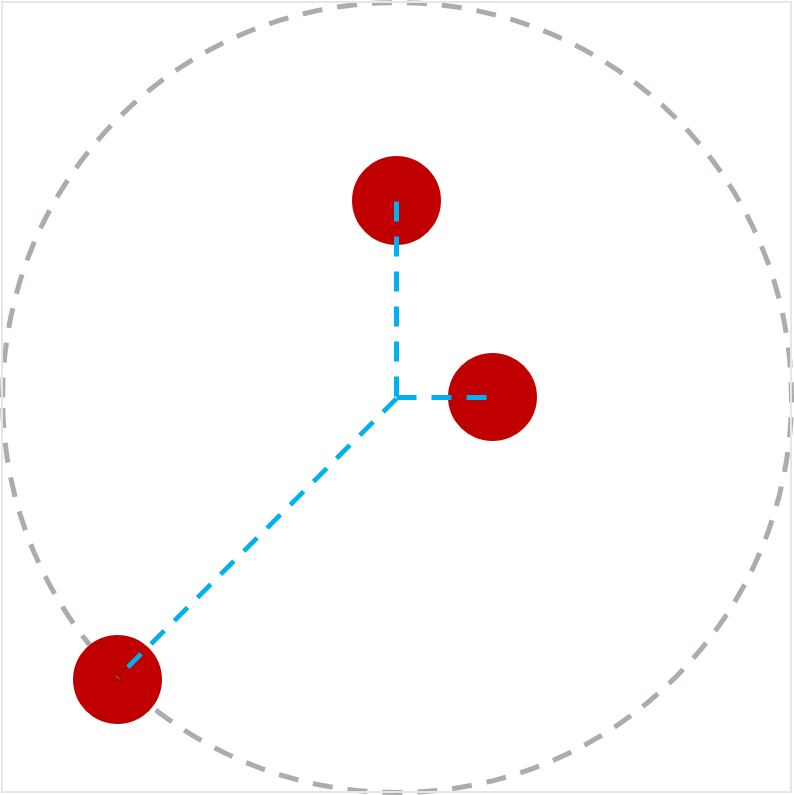
2.5. パスに合わせて回転する: offset-rotate プロパティ
| 名前: | offset-rotate |
|---|---|
| 値: | [ auto | reverse ] || <angle> |
| 初期値: | auto |
| 適用対象: | 変形可能な要素 |
| 継承: | no |
| パーセンテージ: | 該当なし |
| 算出値: | 算出された<angle>値、必要に応じてautoが前置される |
| 標準順序: | 文法に従う |
| アニメーション型: | 算出値による |
| メディア: | visual |
offset transform の回転成分を定義します。 offset path の方向に基づく場合もあり、 offset position 上での方向に依存します。 各値の意味は以下の通りです:
- auto <angle>?
-
offset transform の回転成分は、 offset path の offset position における方向と、 正のX軸(つまり右向きの線)の方向との差分となります。 SVG のパスの方向の計算方法も参照してください。
角度を指定した場合、その角度が回転成分に加算されます。
注: つまり offset path が右方向の場合、 auto は回転を加えません。 右からずれていくと、その回転量が増えます。 auto に角度を指定することで 「開始時の回転」を調整できます。
- reverse <angle>?
-
auto と同じですが、 回転に 180deg を追加します。
- <angle>
-
単独で指定した場合、 offset transform に指定した角度分の回転成分を加えます。 (つまり、offset-rotate: 45deg; は transform: rotate(45deg) と似ていますが、 offset transform の一部として順序付けされます。)
テスト
- offset-rotate-composition.html (ライブテスト) (ソース)
- offset-rotate-interpolation-math-functions.html (ライブテスト) (ソース)
- offset-rotate-interpolation.html (ライブテスト) (ソース)
- offset-rotate-interpolation-001.html (ライブテスト) (ソース)
- offset-rotate-001.html (live test) (ソース)
- offset-rotate-002.html (live test) (ソース)
- offset-rotate-003.html (live test) (ソース)
- offset-rotate-004.html (live test) (ソース)
- offset-rotate-005.html (live test) (ソース)
- offset-rotate-computed.html (ライブテスト) (ソース)
- offset-rotate-parsing-invalid.html (ライブテスト) (ソース)
- offset-rotate-parsing-valid.html (ライブテスト) (ソース)

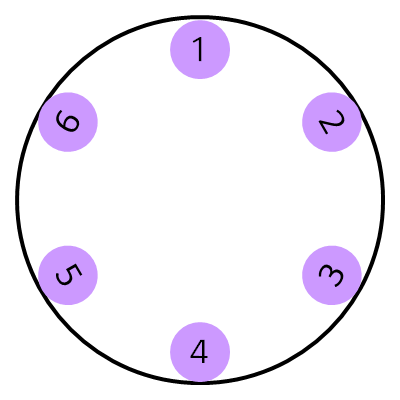
形状のアンカーポイントがパス上の異なる位置に配置され、offset-rotateが0degの場合、形状は回転しません。

offset-rotateプロパティがautoに設定されていて、形状のアンカーポイントがパス上の異なる位置に配置されている場合、形状は現在位置のグラデーションに基づいて回転し、その位置のパスの方向を向きます。

この例では、offset-rotateプロパティがreverseに設定されています。平面はパスの各位置でパスの反対方向を向きます。

最後の例では、offset-rotateプロパティが-45degに設定されています。形状は45度反時計回りに一度回転し、パス上の各位置でもその回転が維持されます。

< style >
body {
width : 300 px ;
height : 300 px ;
margin : 0 px ;
border : solid gray ;
border-radius : 50 % ;
}
. circle {
offset-position : 150 px 150 px ;
offset-distance : 86 % ;
width : 42 px ;
height : 42 px ;
background-color : mediumpurple ;
border-radius : 50 % ;
display : flex ;
align-items : center ;
justify-content : center ;
}
# item1 {
offset-path : ray ( 0 deg closest -side );
offset-rotate : auto 90 deg ;
}
# item2 {
offset-path : ray ( 45 deg closest -side );
offset-rotate : auto 90 deg ;
}
# item3 {
offset-path : ray ( 135 deg closest -side );
offset-rotate : auto -90 deg ;
}
# item4 {
offset-path : ray ( 180 deg closest -side );
offset-rotate : auto -90 deg ;
}
# item5 {
offset-path : ray ( 225 deg closest -side );
offset-rotate : reverse 90 deg ;
}
# item6 {
offset-path : ray ( -45 deg closest -side );
offset-rotate : reverse -90 deg ;
}
</ style >
< body >
< div class = "circle" id = "item1" > 1</ div >
< div class = "circle" id = "item2" > 2</ div >
< div class = "circle" id = "item3" > 3</ div >
< div class = "circle" id = "item4" > 4</ div >
< div class = "circle" id = "item5" > 5</ div >
< div class = "circle" id = "item6" > 6</ div >
</ body >
2.6. offsetのショートハンド
| 名前: | offset |
|---|---|
| 値: | [ <'offset-position'>? [ <'offset-path'> [ <'offset-distance'> || <'offset-rotate'> ]? ]? ]! [ / <'offset-anchor'> ]? |
| 初期値: | 個々のプロパティを参照 |
| 適用対象: | 変形可能な要素 |
| 継承: | 個々のプロパティを参照 |
| パーセンテージ: | 個々のプロパティを参照 |
| 算出値: | 個々のプロパティを参照 |
| アニメーション型: | 個々のプロパティを参照 |
| 標準的な順序: | 構文に従う |
テスト
- offset-interpolation.html (ライブテスト) (ソース)
- offset-position-composition.html (ライブテスト) (ソース)
- offset-position-interpolation.html (ライブテスト) (ソース)
- offset-parsing-invalid.html (ライブテスト) (ソース)
- offset-parsing-valid.html (ライブテスト) (ソース)
- offset-shorthand.html (live test) (ソース)
- inheritance.html (live test) (ソース)
- offset-supports-calc.html (live test) (ソース)
これは、offset-position、offset-path、offset-distance、offset-rotate、offset-anchorを設定するためのショートハンドプロパティです。省略された値は初期値に設定されます。
2.7. オフセット変形の計算
offset transformは、2次元変形であり、平行移動の後に回転が行われます:
-
要素のアンカーポイントとoffset positionを一致させる(X, Y)で要素を移動します。
-
offset-rotateで指定された角度だけ要素を回転させます。
3. <basic-shape>用の等価なパス
<basic-shape>の定義は、[css-shapes] にて各関数が 形状 ― 輪郭、内部、外部を持つ2次元の図形 ― を生成するものと定義されています。
この仕様では、<basic-shape>を、特定の形状の輪郭をなぞる線—始点、終点、方向を持つパスとして扱います。 パスの詳細はSVGによって定義されます。[SVG2]
すべての<basic-shape>値の等価なパスは以下の通りです:
- <path()>
- <shape()>
-
パスは定義されたパスです。[SVG11]
- <circle()>
- <ellipse()>
-
パスは円/楕円の輪郭です。 パスは円/楕円の最も右の点から始まり、 4つの円弧(各々が円/楕円の4分の1)で構成され、 時計回りに進み、 segment-completing close path操作で終わります。
- rect()
- inset()
- xywh()
- inset()
-
パスは(角が丸い場合も含む)長方形の輪郭で構成され、 4または8つのセグメント(角が丸いかどうかにより異なる)で構成され、 segment-completing close path操作で終わります。 パスの開始は上辺の左端(角が丸い場合はすぐ右)から始まり、 右方向(時計回り)に進みます。
- <polygon()>
-
パスは多角形の輪郭で、 各座標ペアを次の座標ペアに直線で接続し、 最後は最初の座標に戻り、 segment-completing close path操作で終わります。
これらすべてにおいて、 パス上の任意の点での方向はSVGによって定義されます。 SVG 2 § 9.4 Path directionalityを参照してください。
注: これらはすべて、SVGのshape elementsの「等価なパス」に一致することを意図しています。
注: このリストは、<basic-shape>関数の完全なセットと同期している必要があります。 もし何かが欠けている場合、 それは仕様バグとみなされるべきです。 このリストは将来的にShapesに移動する可能性がありますが、 現時点ではこの仕様のみがこの情報を使用するため、ここに保持されています。
4. プライバシーに関する考慮事項
この仕様では新たなプライバシーに関する考慮事項は導入されません。
5. セキュリティに関する考慮事項
この仕様では新たなセキュリティに関する考慮事項は導入されません。
変更履歴
この節は規範的ではありません。
2018年12月18日作業草案以降の変更点
-
offset-position:normalを追加し、通常位置のデフォルト動作を上書きせず、ray()に"at <position>"を追加 #504
-
offset-pathを <url> に修正(<url()>ではなく) #508
-
offset transformの計算方法をCSS Transforms 1の用語で書き換え
-
「offset-distance」と「offset-rotate」について明確化
-
「contain」キーワードの動作を簡素化・明確化 #363
-
circle()/ellipse()の等価なパスをSVGに合わせて変更 #506
-
coord-boxで参照される要素は、変形された要素の包含ブロックを確立する要素であり、SVGコンテキストではcoord-boxはview-boxとして扱われる #369
-
<basic-shape>のパス定義を付録へ移動
-
<coord-box>が任意のパス関数と組み合わせ可能に #369
-
初期位置の明確化
-
path()を<basic-shape>セクションに移動
-
<ray-size>を省略可能にし、デフォルトを"closest-side"に設定
-
導入部を書き直し
-
ray()定義を独立した小節に移動
-
offset pathの定義を明確化 #66
-
<coord-box>型がCSS Box 3で定義されていることを明確化
-
<ray()>および<path()>型の構文を修正
-
「modulo」の定義が数学的なものであり、C/JSの定義ではないことを明確化 #339
-
SVGに合わせて鋭角パス境界での方向性を修正 #209
-
offset-pathセクションを再構成し可読性向上
-
極角の概念を説明した注記を削除
-
offset-distanceの算出値を算出
値に変更 -
「animatable」を「Animation type」に置換
2015年4月9日最初の公開作業草案以降の変更点
-
motion-pathをoffset-pathに名称変更し、polar-angleと統合しました。
-
motion-offsetをoffset-distanceに名称変更し、polar-distanceと統合
-
offset-positionを追加し、パスのoffset starting positionを指定できるようにし、polar-originを[CSS-ROUND-DISPLAY-1]から統合
-
offset-anchorを追加し、要素の原点を指定できるようにし、polar-anchorを[CSS-ROUND-DISPLAY-1]から統合
-
offset-rotateでautoまたはreverseを<angle>と組み合わせて回転変形を指定できるように
謝辞
fantasai、 Hyojin Song、 その他CSS WGメンバー全員に レビュー、コメント、修正に感謝します。